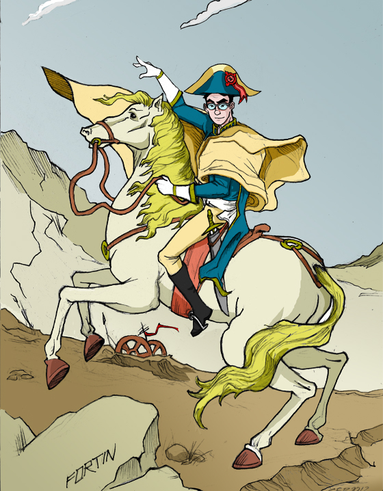
For those of you who haven’t purchased The Essentials DVD (which is just about everyone), then you didn’t see this funny visual gag on the DVD itself. Guess what arrogant jackass drew himself as Napoleon for the painting in the background? This guy!
Author Archives: Jacob
Failed Project: Darware

This one goes way back to 1999, when my buddy Tom Badger and I wanted desperately to start a hardware company that would manufacture ‘e-readers’ from a technology we had read about for years called ‘e-ink’. Unfortunately it turned out that we were way out of our depth, and instead the ‘Caveman’ (our version of the Kindle) was destined to be just another failed project.
Light and Motion Postcard #2
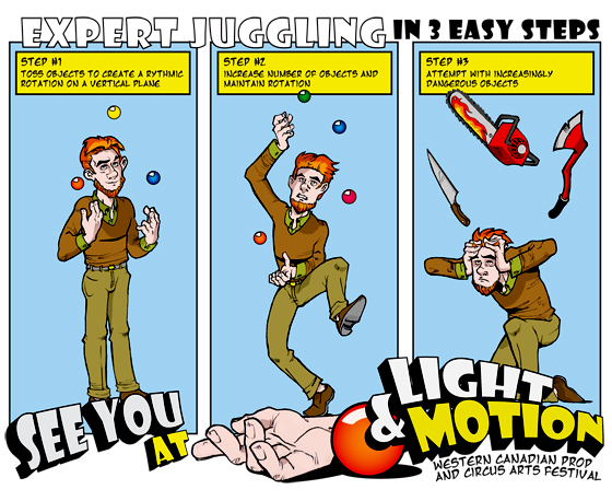
I think postcards are an awesome way to advertise for a show, and as soon as Bible Stories comes out, I might do a short series of similarly ‘themed’ advertisements in order to create excitement and buzz. It’s only about two days work to make one of these, so it’s not too bad.
The inspiration for the guy in brown is a musician friend I made in Calgary, the talented Chris Tenz.
Space Cops Must Happen
If you don’t actually know who the man in the poster is, then just pretend you do so no one else will realize how fucking clueless you are. Nod your head at parties, acknowledge that Mr. Plinkett has the best video reviews EVER, and then kindly catch up to the rest of the population.
Re-Mastered Comic: Scooby Don’t
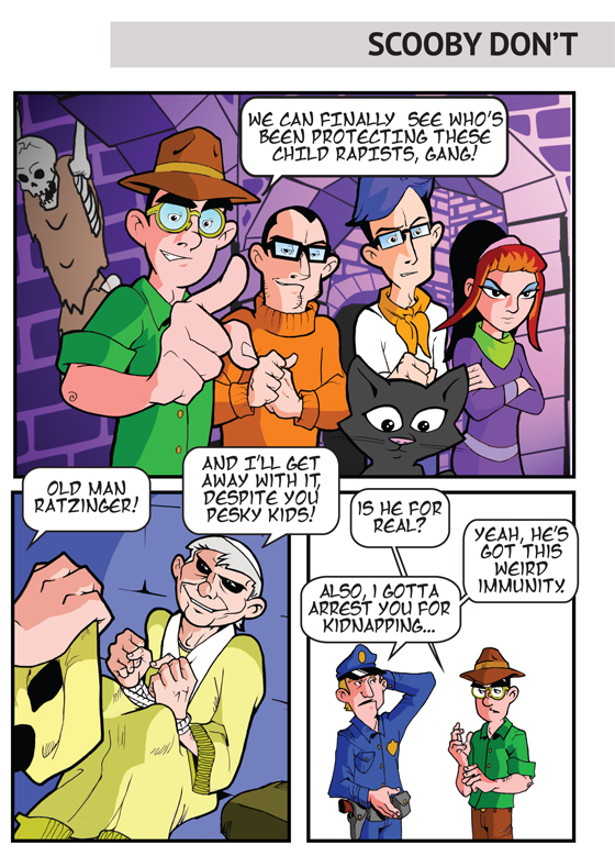
This is one of the comics I remastered for The Essentials DVD. It was actually the last one I ever made, but it’s probably my favorite. The ‘gang’ consists of Ryan (Velma), Jeff (Fred), Daphne (Carisa) myself (Shaggy) and Ryan’s annoying cat Saban (Scooby). This was shortly before Pope Benedict XVI would ‘retire’ and disappear from the spotlight.
Special thanks to Dan Drew, member #6 who helped with the backdrop of the first frame. He did a great job!
Fightlinker Jackal Logo 2.0

I was never truly satisfied with the original ‘Fightlinker Jackal‘ because it was rushed and the proportions were all over the place. Worse still, it was done sloppily using Illustrator, and if you tried to change its size, it would fuck up. Enter the second Jackal logo I made, almost universally hated by all the fans who preferred the old one. I’ll let you chose which one you think is cooler.
You’ve Got Mail
For those of you who have signed into your account, you may have noticed a new messaging service. It’s our own internal communication system, and with it, I’ll be sharing all kinds of updates, as well as sending your secret codes for achievement via this service. So stay tuned, and if you have any questions, email me! All you need to do is check your inbox, and the rest should be easy.
Light and Motion Postcard #1
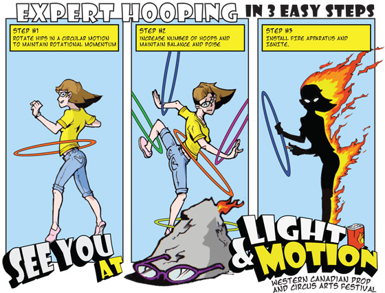
When Carisa and I were a couple, I would help her with a circus arts festival she called Light and Motion. This was a postcard ad I designed that also functioned as a ‘passport’. Unfortunately, no one used it for the intended purpose and it ended up being prohibitively expensive. Also, there were a bunch of spelling mistakes, typical Jake stuff.
Now renamed Prop Fest, it since has become a bi-annual festival. If you look hard enough, you can find me on their website.
New Format, New Design
After announcing that I was delaying the book, I recognized my failure in opening the lines of communication with the people who matter most in this whole project: the fans. What better way to do this than through a personal website? To be fair, I wasn’t looking forward to the thought of needing to redesign my site, especially after the hurtful loss of my art-book. Still, as my producer recently told me, the only way to slay the demons of self doubt is to get right back in the saddle (as soon as you stop using so many sloppy metaphors, of course).
“So where should I start?” I wondered. “Why not take an old design I really liked that never worked for TGA, tweak it until it looks different enough so no one notices, and get the most done with minimal effort?” I was even able to ‘pass the programming buck’ to a good friend, avoiding countless hours struggling to make my design work properly.
I’ve finally accepted that leaving atheism scene did not mean I’ve lost my appetite for attention-seeking. In a sense, I now feel as though without the constraints of representing ‘atheism’ in any way, shape or form, I can finally indulge in some glorious self-aggrandizing behavior without needing to worry about how it might make ‘atheism’ look bad.
Of course all of this is pretty vague, and as usual I often promise more than I can deliver. But I hope you’ve appreciated my honesty in owning up to my failures, and you still enjoy it when I try to impress the shit out of you.
Failed Project: A Winner is Me
I say failed, but I eventually want to resurrect this puppy if I can find someone to animate it. Jeff managed to do the first one, but it was a huge ordeal and he didn’t enjoy it one bit. If any of The 300 has some experience with flash, we still have all the animation files for it. A man can dream…
