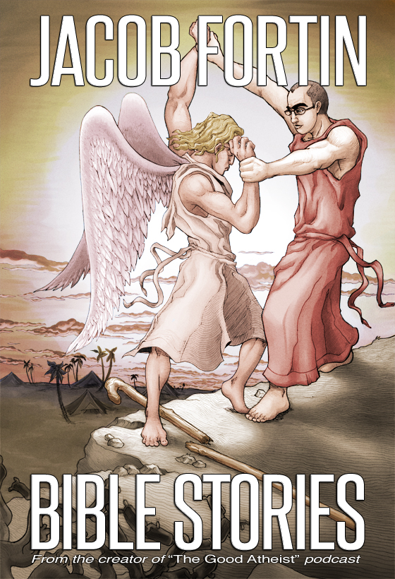
Some of you stalkers out there might be able to tell the difference between this cover and the one I put up on the Indiegogo campaign. Well, I had to pick a size for the actual book, and I wanted to try and balance out the text with the visuals. The original’s font was a tad dark and too close to the margins. If any of you feel different, feel free to let me know in the forums.
Now, you know that me posting this up means it’s getting dangerously close to the time when I release the free chapter I’ve been teasing you all about!

